Who is Childs Farm?
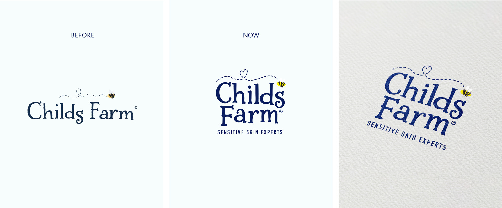
Childs Farm is a leading children’s skincare brand, known for its playful personality and gentle formulations. As the portfolio expanded into new markets, it needed a refresh to address evolving consumer challenges.
How do you make 60+ products feel like one playful, trusted brand?
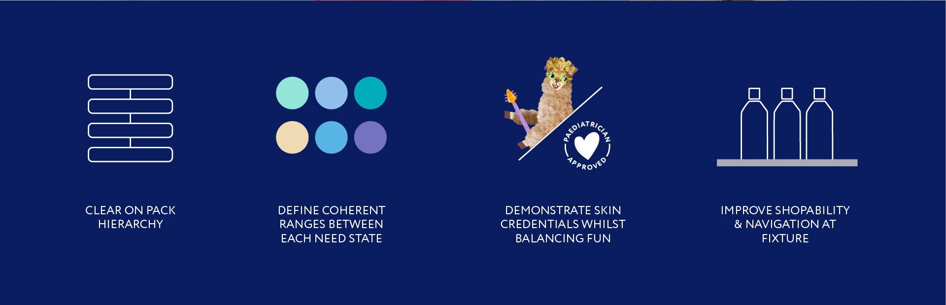
• Elevate skincare credibility without losing charm
• Create a cohesive “one brand” experience across 60+ products
• Simplify on-pack messaging to help parents make quick choices
• Create a cohesive “one brand” experience across 60+ products
• Simplify on-pack messaging to help parents make quick choices
Approach
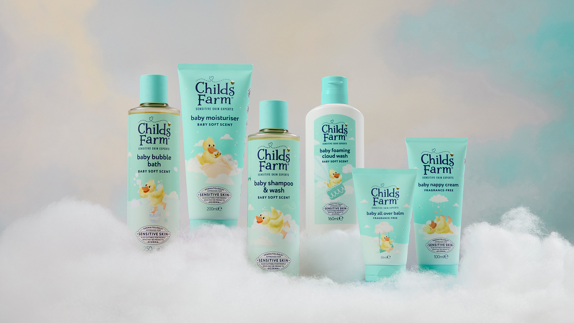
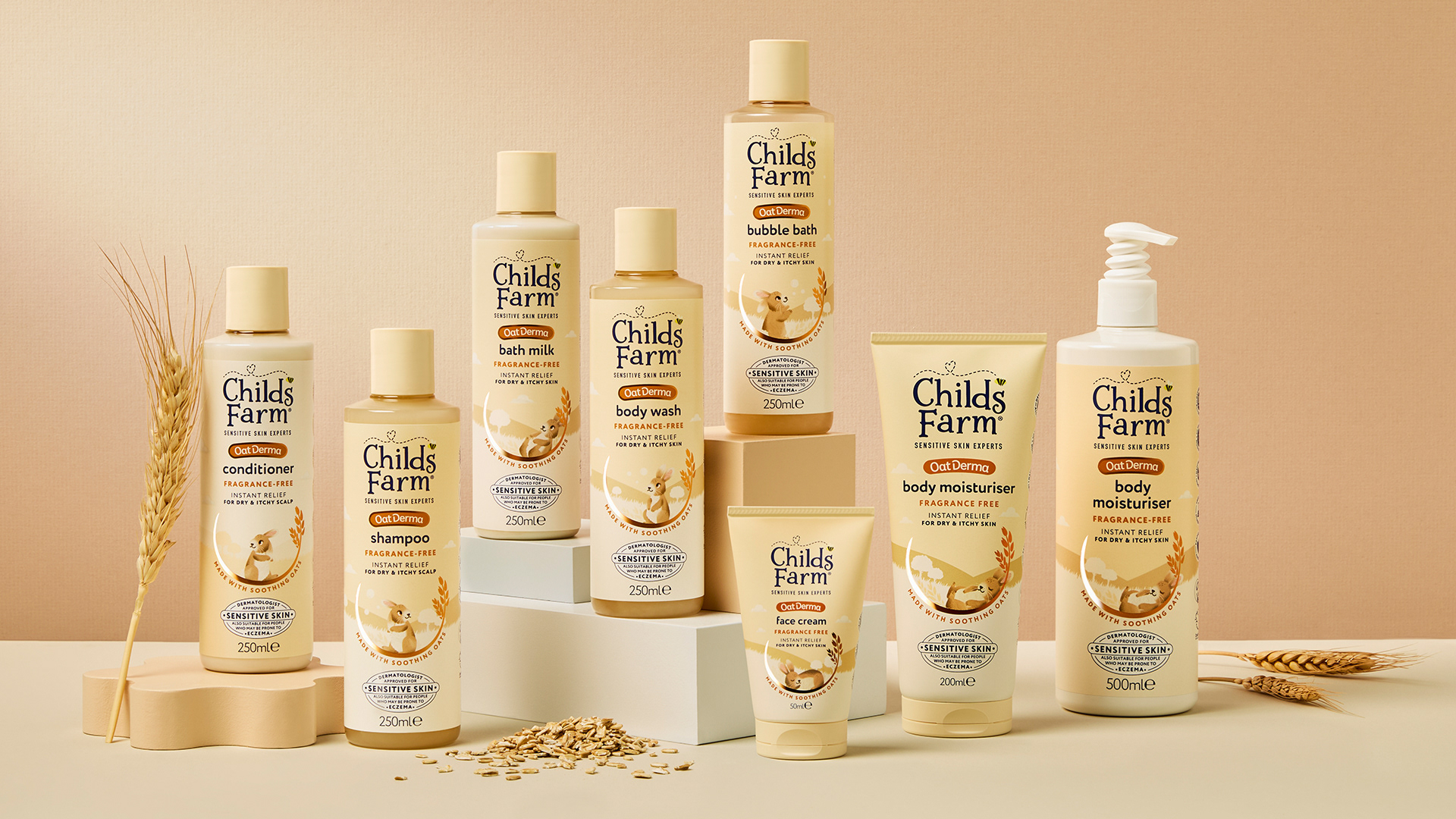
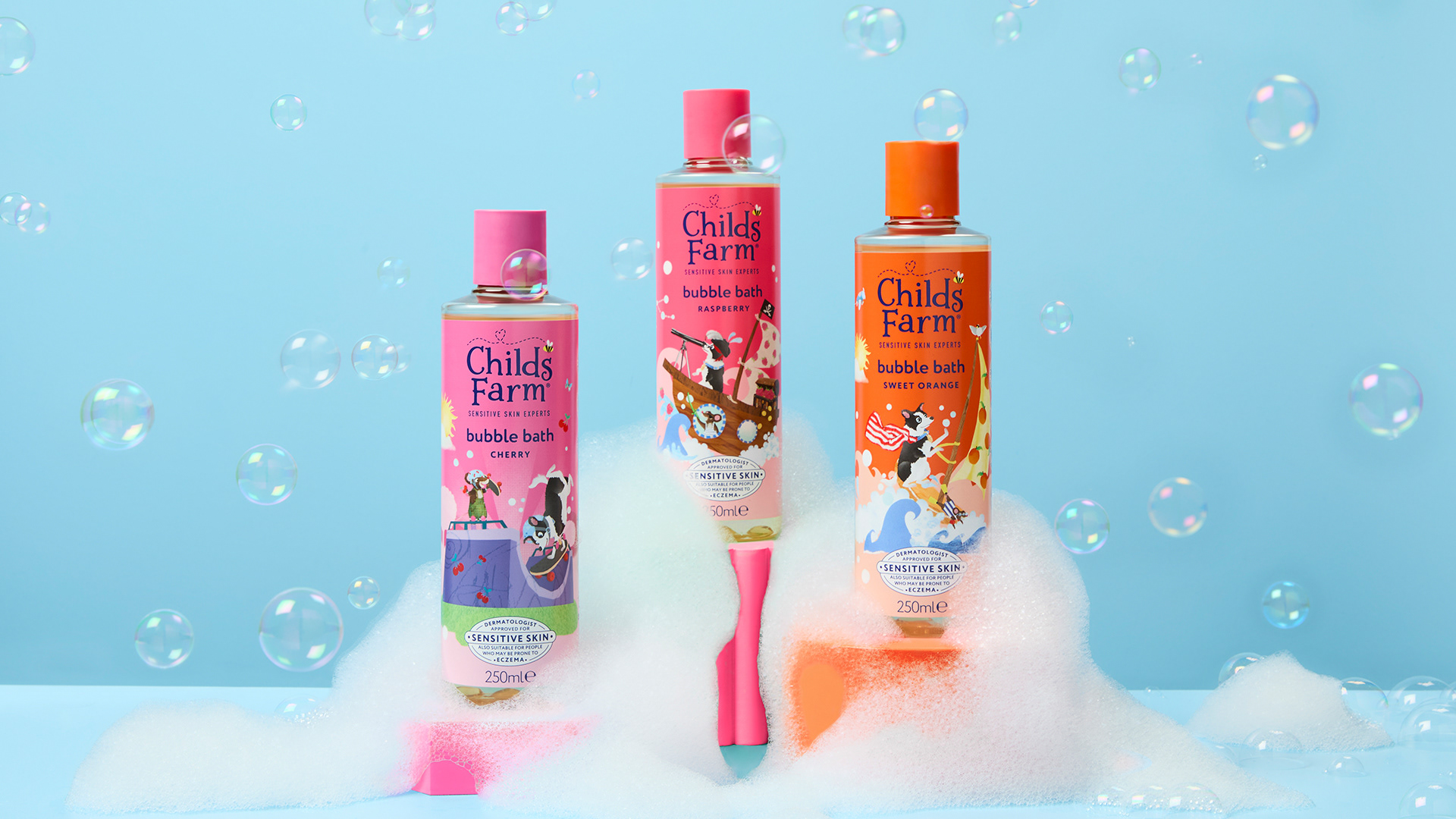
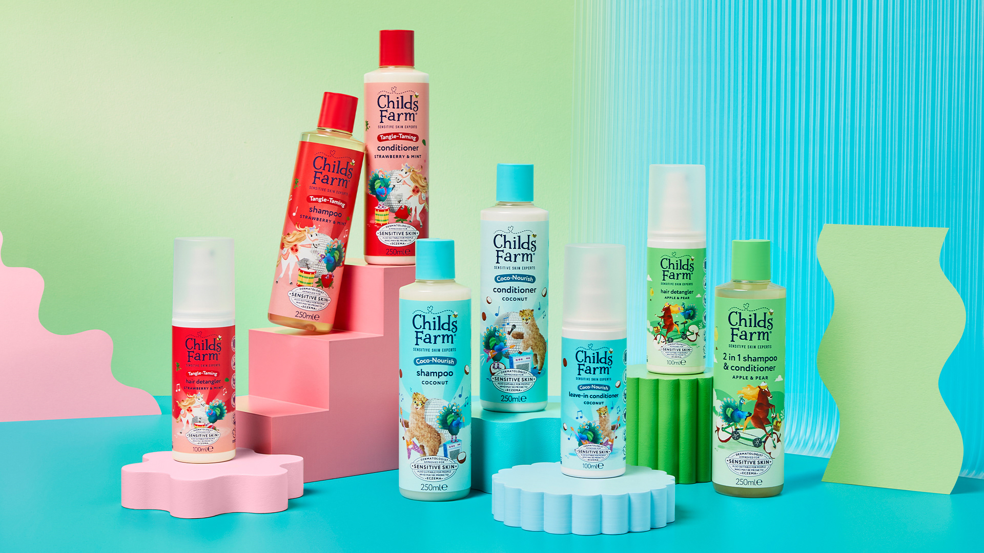
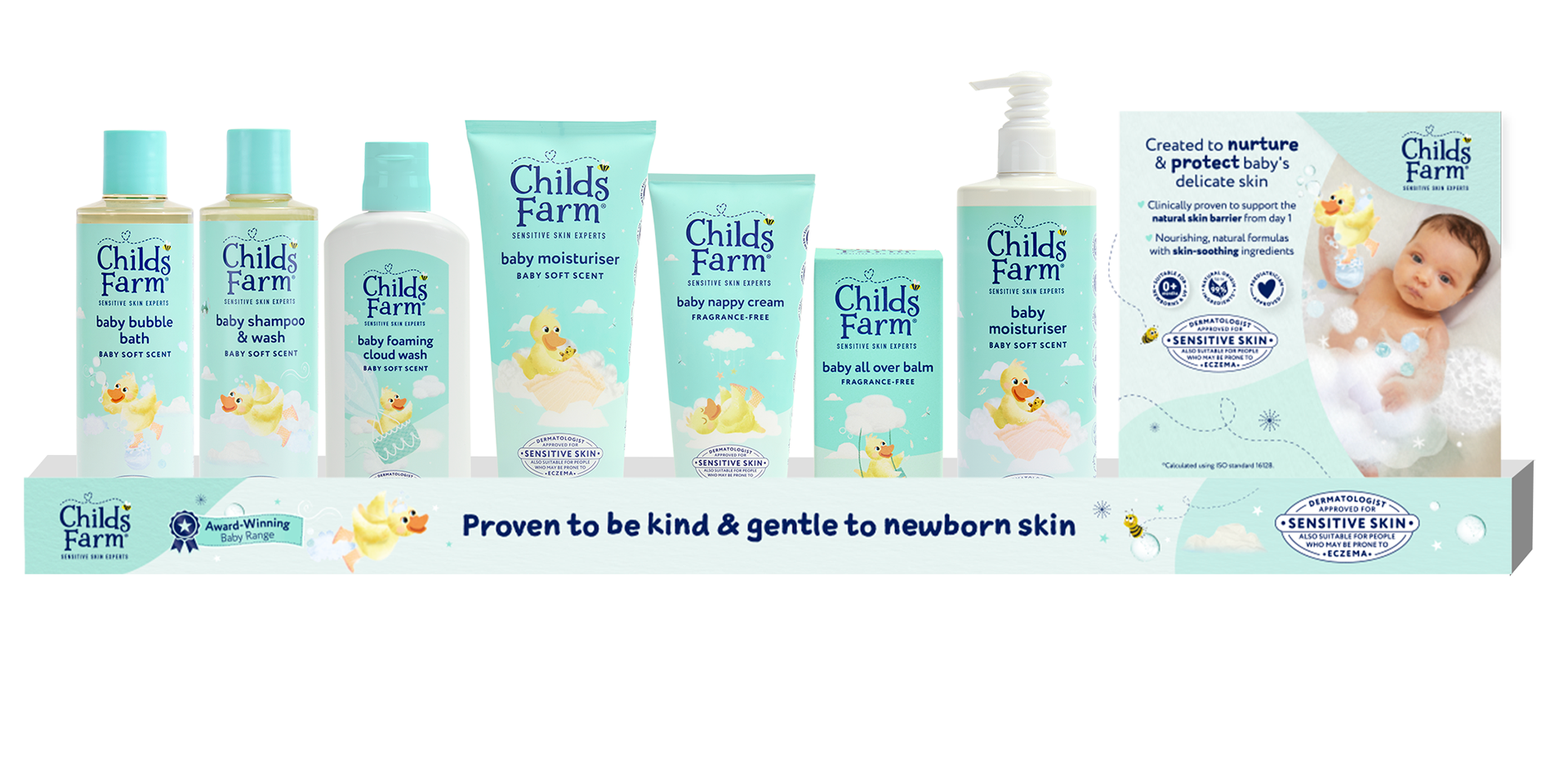
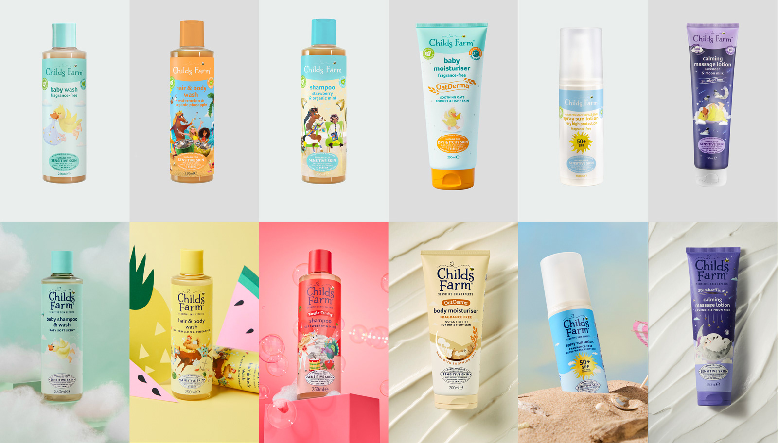
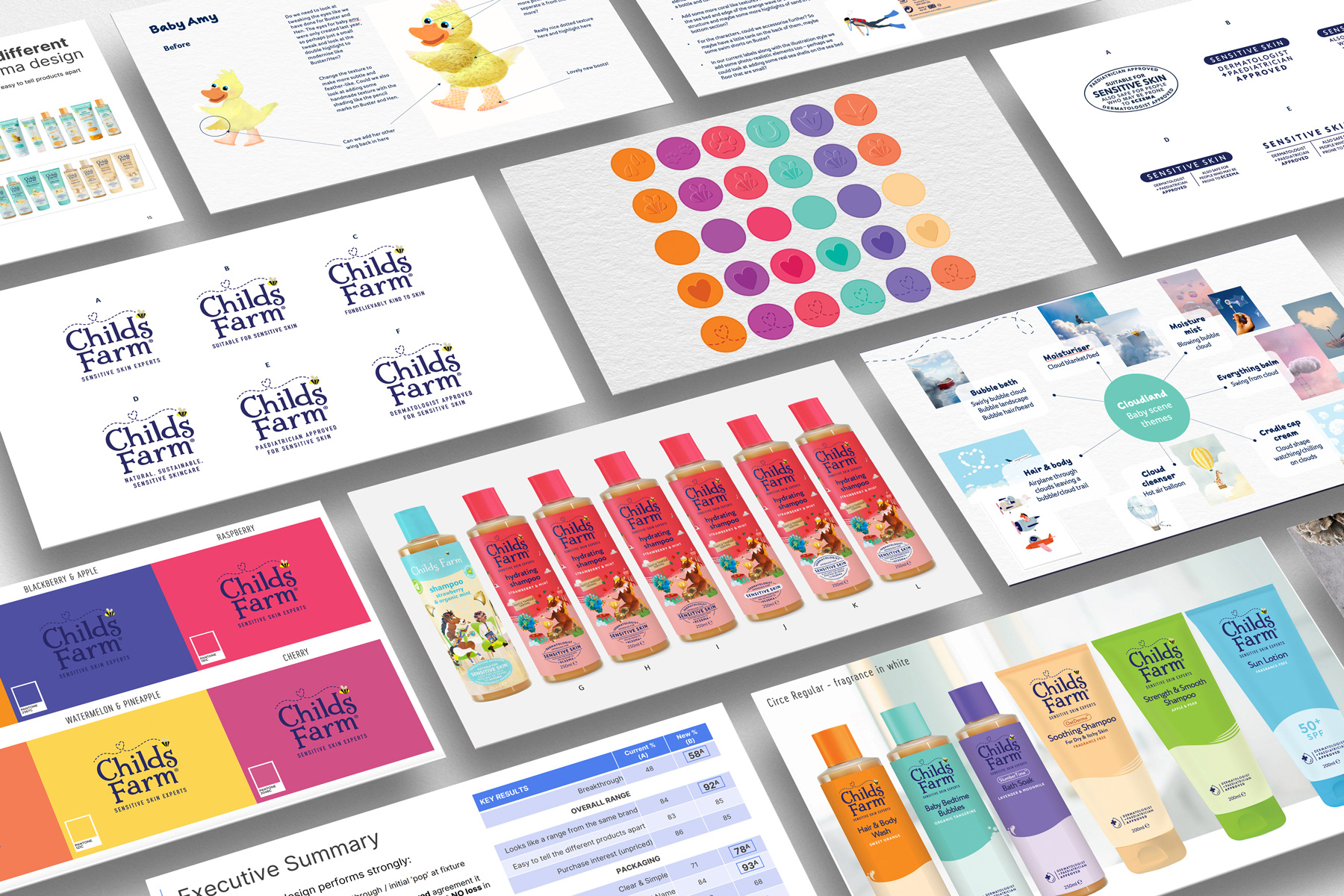
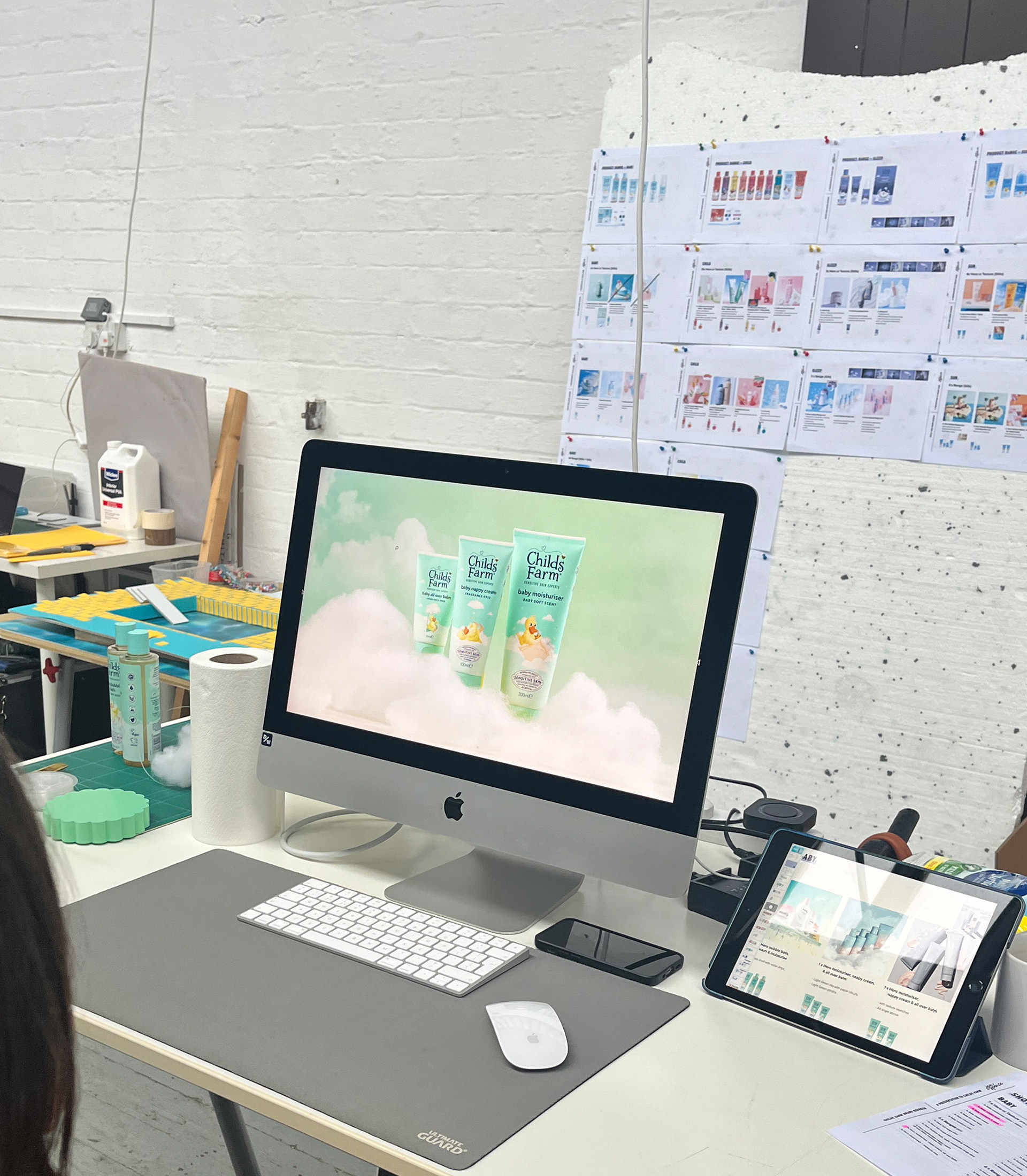
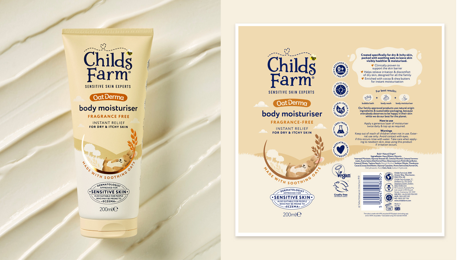
Led a full portfolio redesign across 60+ SKUs.
Collaboration: Worked closely with the Global Product Manager, an external agency, and an illustrator.
Portfolio Structure: Developed a regimen-based layout to guide parents through the product range.
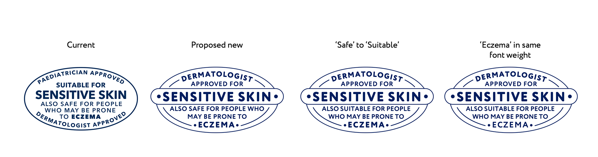
Visual Hierarchy: Balanced reassurance and playfulness through illustration, typography, and tone.
Portfolio Structure: Developed a regimen-based layout to guide parents through the product range.
Visual Hierarchy: Balanced reassurance and playfulness through illustration, typography, and tone.
Deliverables
📦 60+ print-ready artworks
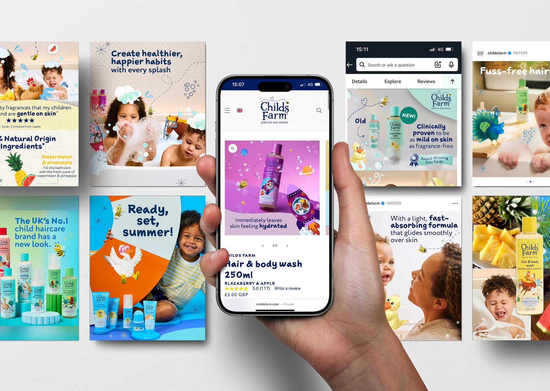
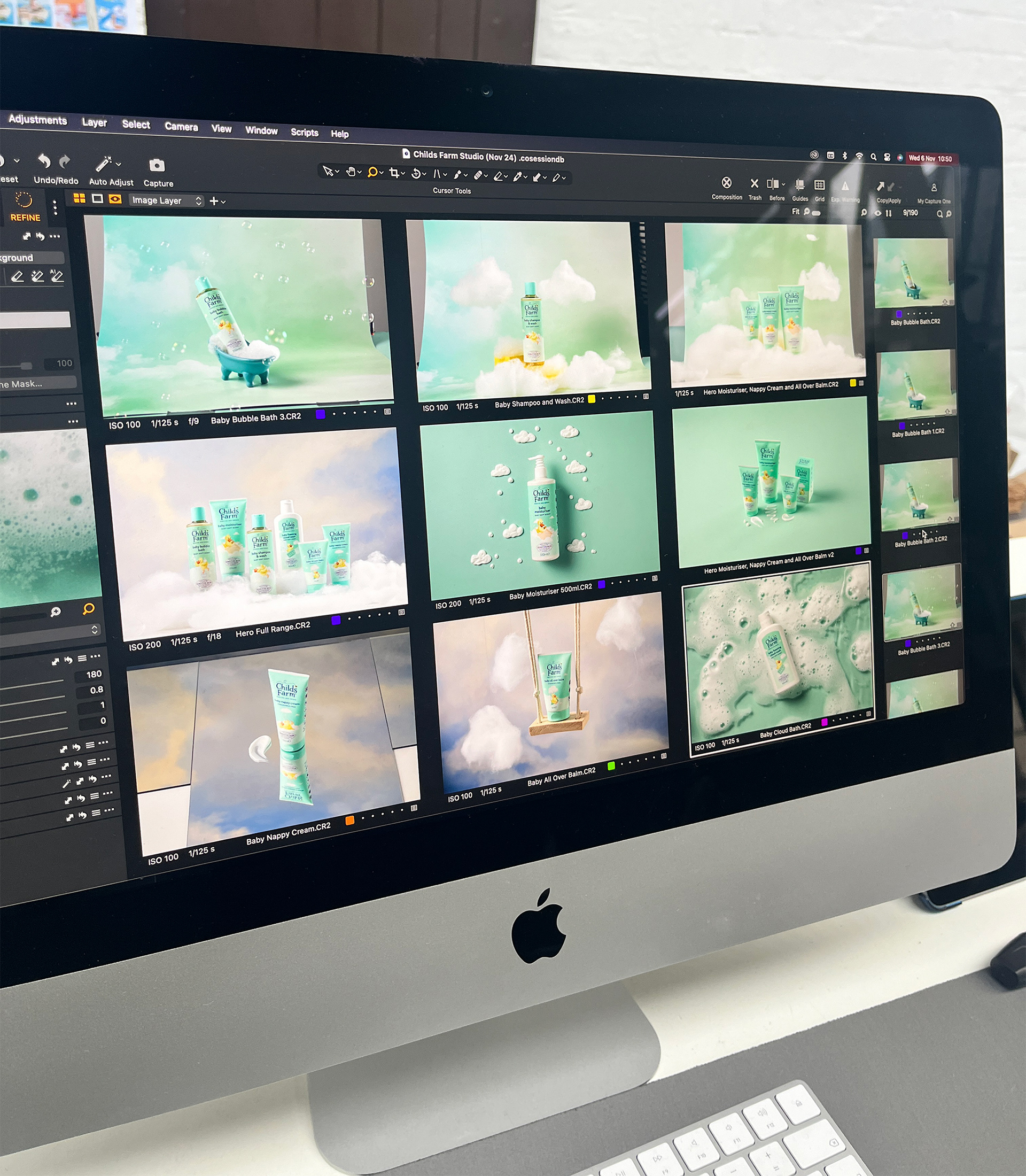
📸 Art direction for two brand shoots, producing 370 images & 8 videos with Jen Spence Production
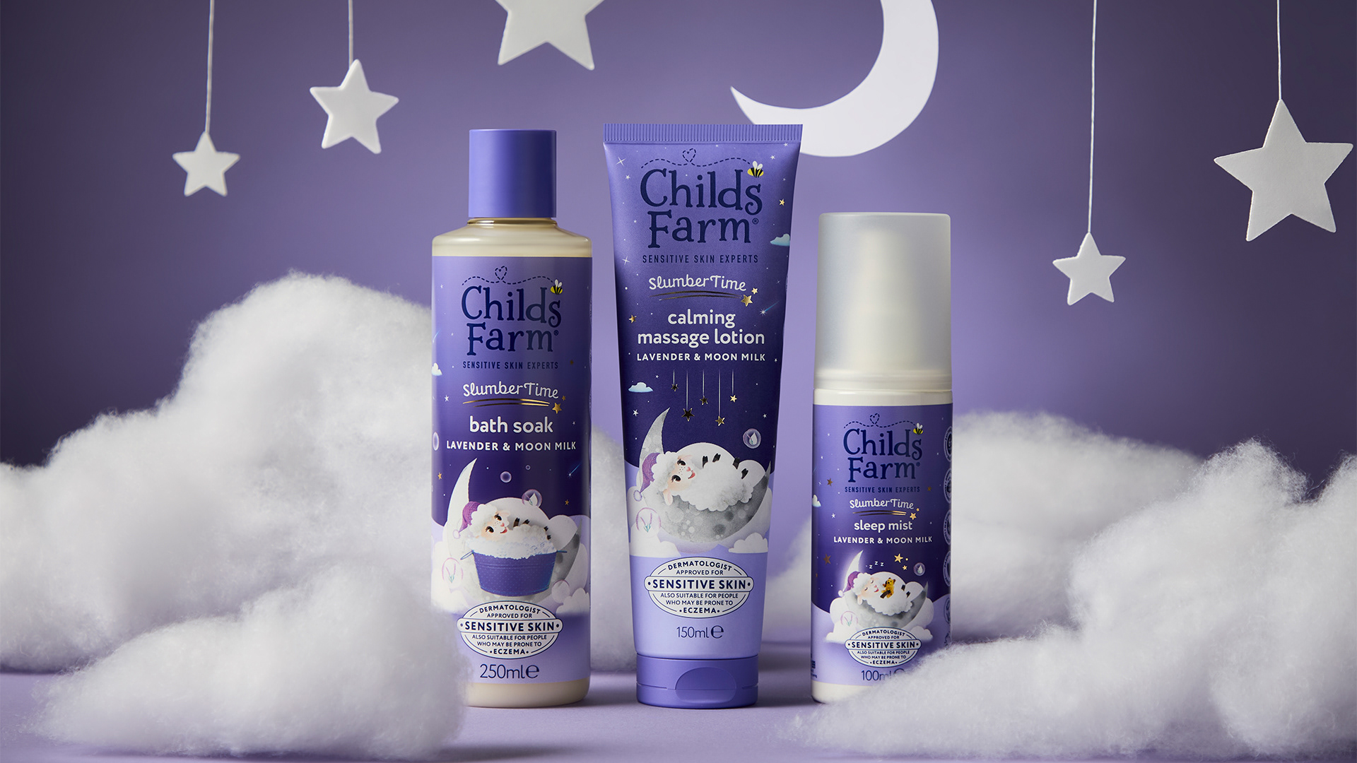
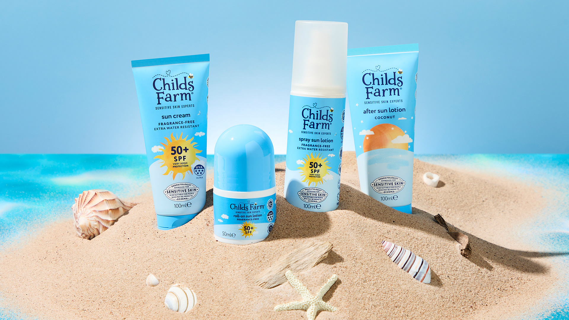
🎨 Briefed & collaborated on 20+ on-pack scenes, including character redesigns and new creations
💻 300+ refreshed digital shelf assets
📸 Art direction for two brand shoots, producing 370 images & 8 videos with Jen Spence Production
🎨 Briefed & collaborated on 20+ on-pack scenes, including character redesigns and new creations
💻 300+ refreshed digital shelf assets
Results
📈 Best two weeks of core EPOS in 4.5 years
💥 OatDerma Sales: +132% EPOS growth
💡 Haircare Sales: +11% EPOS growth
🏬 Distribution: +7% growth in Boots since launch
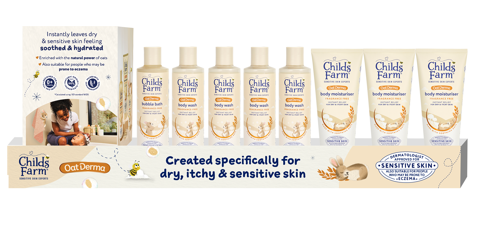
🛒 Store Fixtures: Full Boots relaunch with branded trays
💥 OatDerma Sales: +132% EPOS growth
💡 Haircare Sales: +11% EPOS growth
🏬 Distribution: +7% growth in Boots since launch
🛒 Store Fixtures: Full Boots relaunch with branded trays
Listening to the Consumer - The New Design:
📊 Achieved a significantly higher breakthrough at the fixture with +10% points
👀 No loss among current Childs Farm buyers
🛒 No evidence of any risk to purchasing associated with the redesign
✨ Significantly improved clarity, simplicity, and branding
🏅 No compromise to premium credentials; design remains fun and playful
👀 No loss among current Childs Farm buyers
🛒 No evidence of any risk to purchasing associated with the redesign
✨ Significantly improved clarity, simplicity, and branding
🏅 No compromise to premium credentials; design remains fun and playful